Design for Homelessness
| Design Fellow @ Stanford d. School | March-September 2021 |
Project Summary
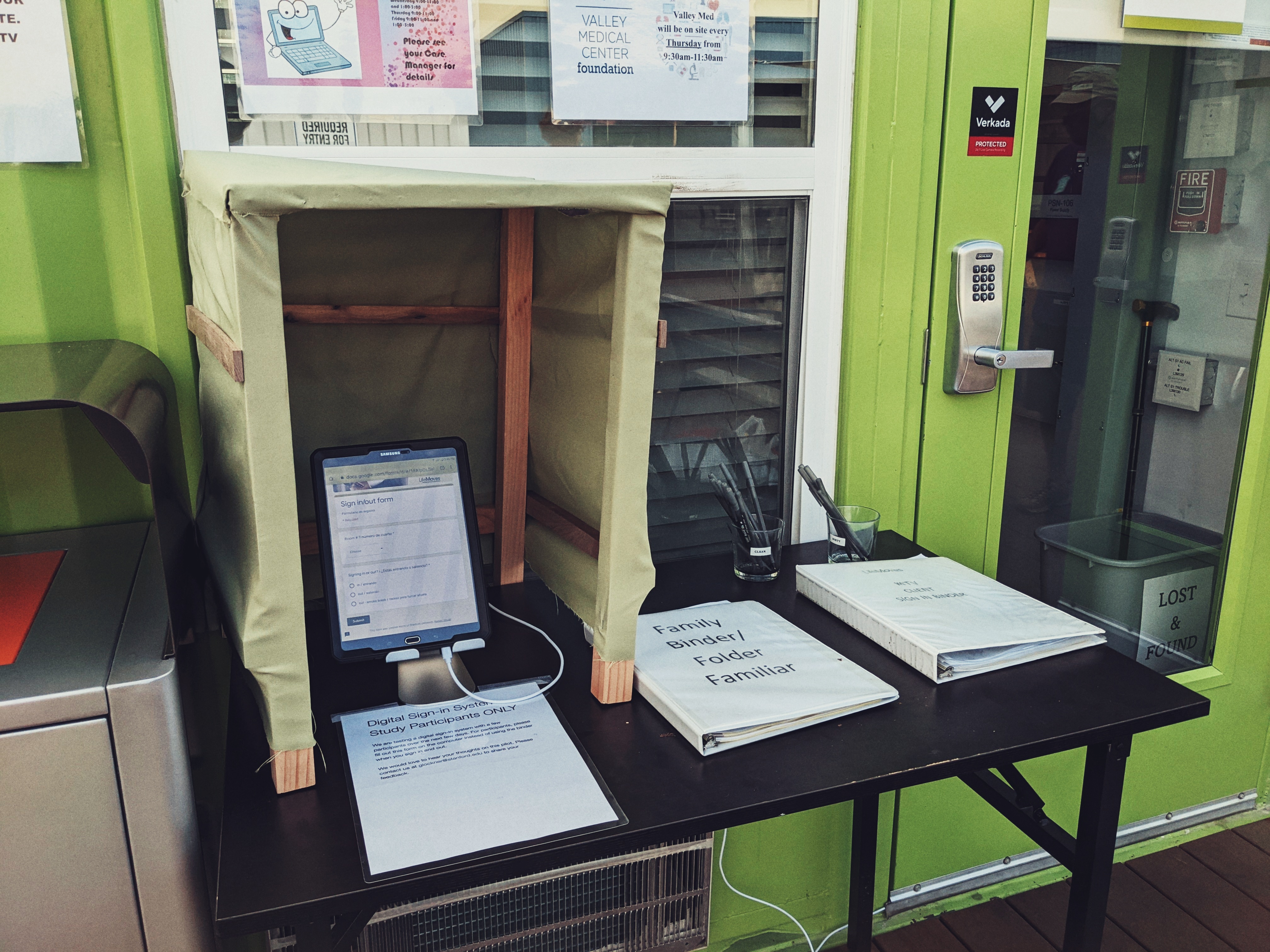 We created and successfully implemented a scalable, low cost digital kiosk system currently used by six shelters, serving over 500 homelessness clients daily. Clients (people experiencing homelessness) can use this kiosk to sign in and out with privacy. Staff have a user interface to better track and manage the safety and well-being of their clients.
Motivation
Growing up in the Bay Area, I noticed the increase in the homelessness population. I remember when I was young, my mom and I walked past a man on the ground, and I asked my mom, “Why am I here and why is he there?” It was a naive question. As a child, I just wanted people to be happy and equal. It’s a world I still strive for.
Design Process
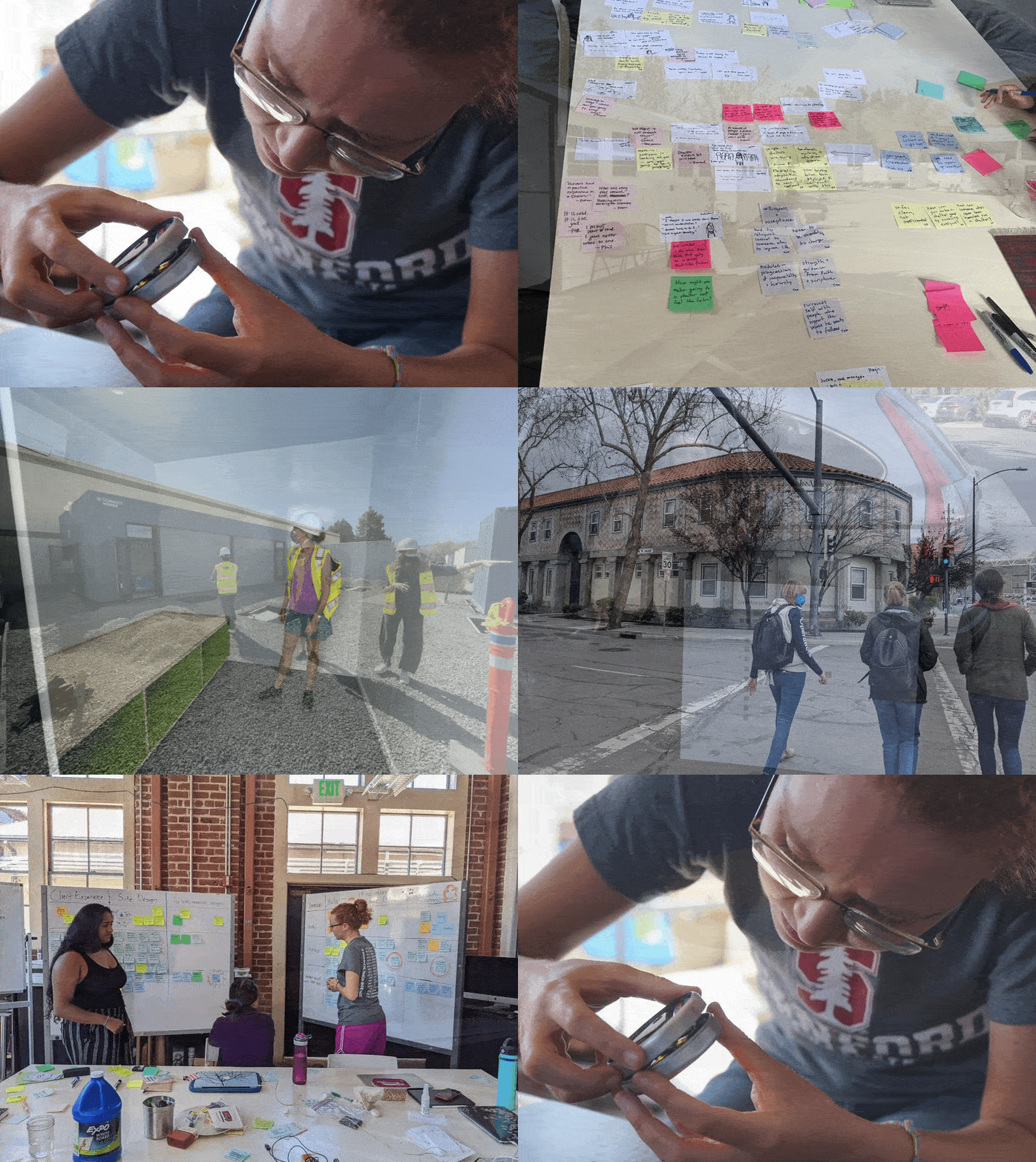
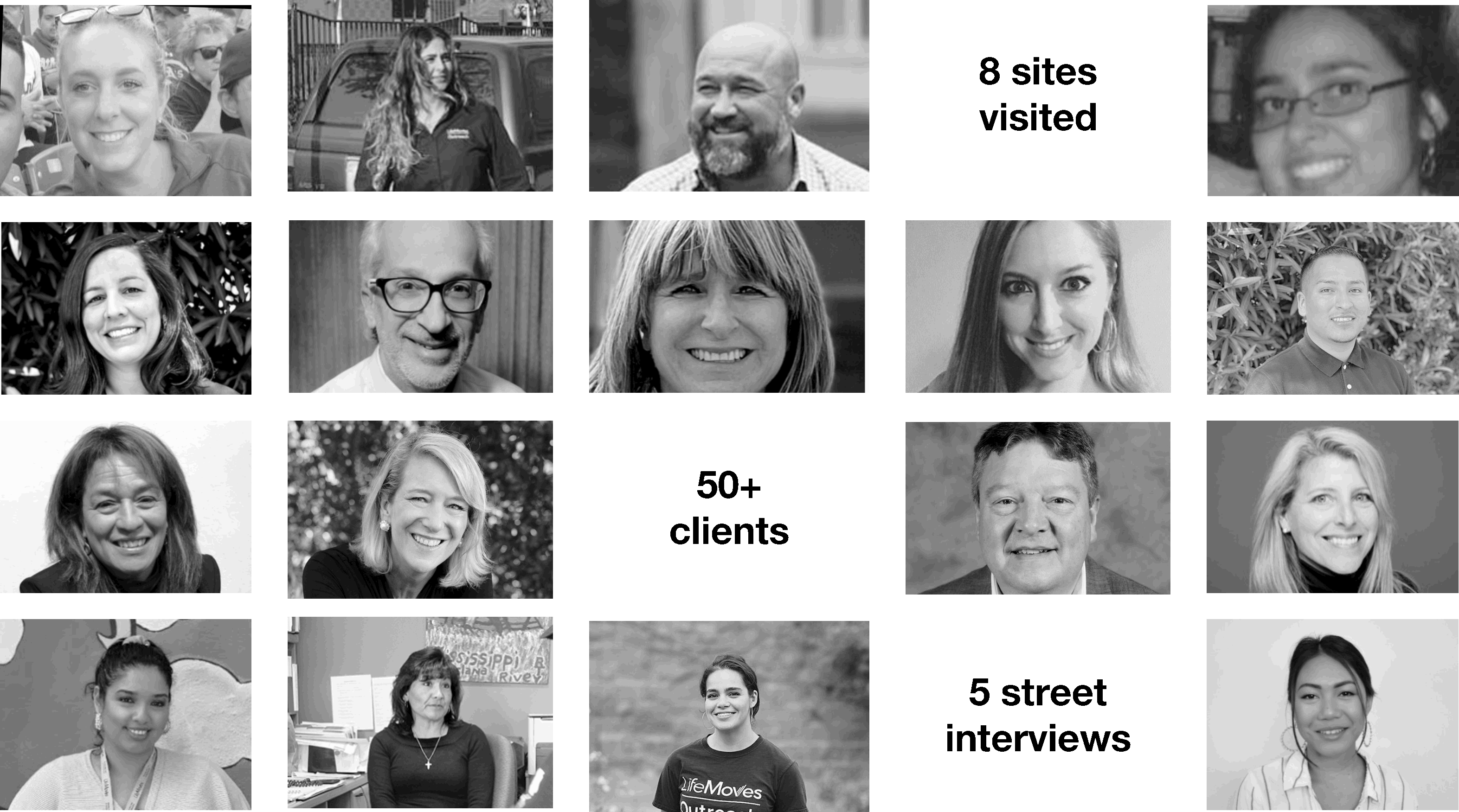
Design is filled with ambiguity. My team and I were tasked to find a problem and to then design a solution for LifeMoves, a homelessness organization that has been operating in the Bay Area for over 35 years with 26 shelter locations. We visited eight of their shelters, spoke with over 50 clients, and conducted interviews with those currently on the streets.
We started our needfinding process at the new interim housing site in Mountain View. At this site, every client has their own room that locks.
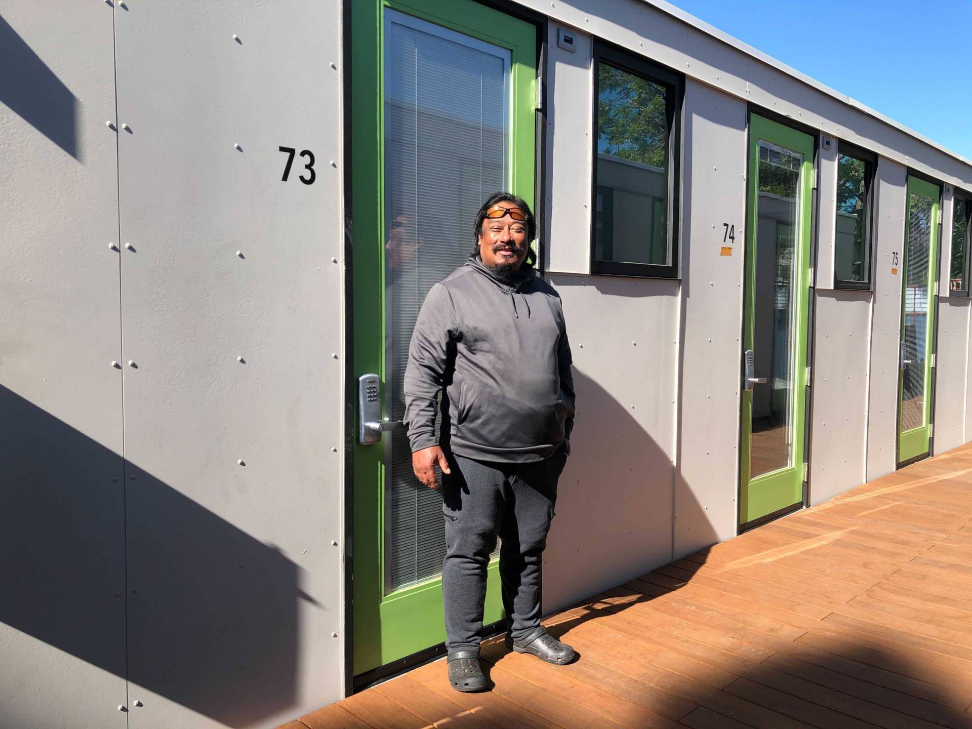
After talking with some clients, we quickly discovered a friction point: bed checks.
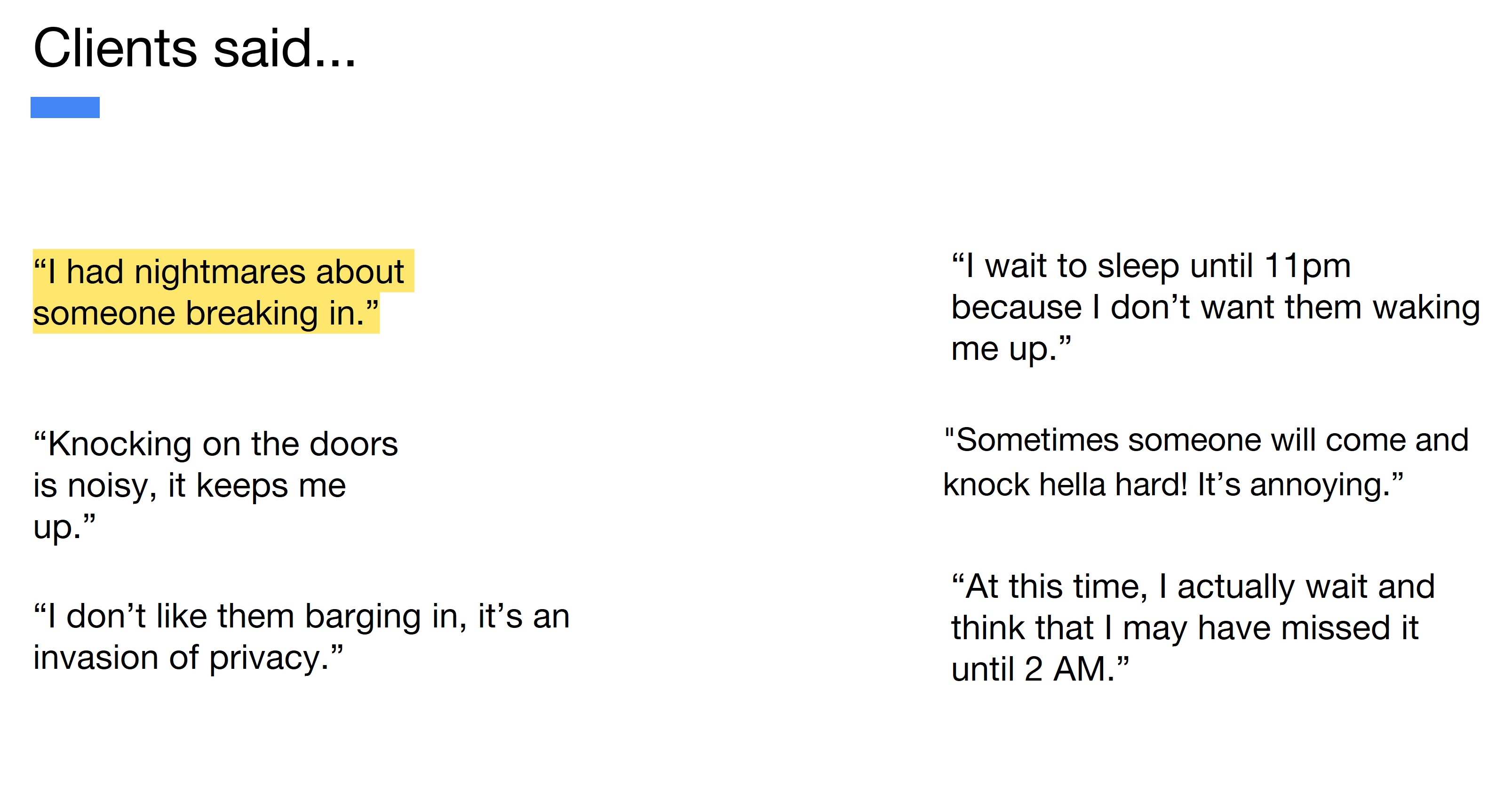
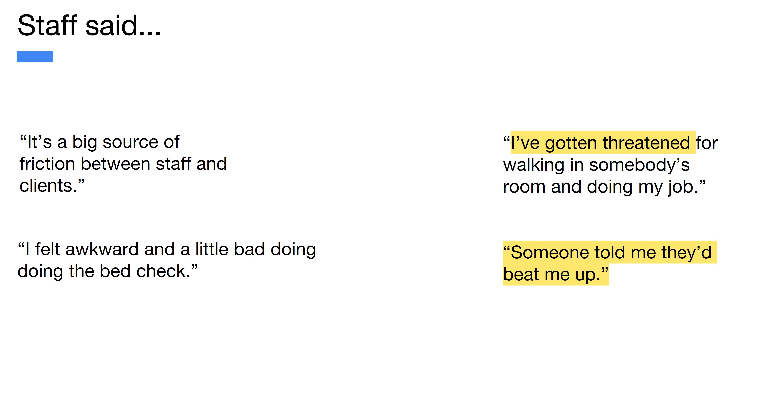
Every night, staff open their doors to check to see if the client is present. Not only do clients not like them, staff were also getting threatened for doing them.
How might we create a dignified and independent way for trauma sensitive clients to notify staff they are present?
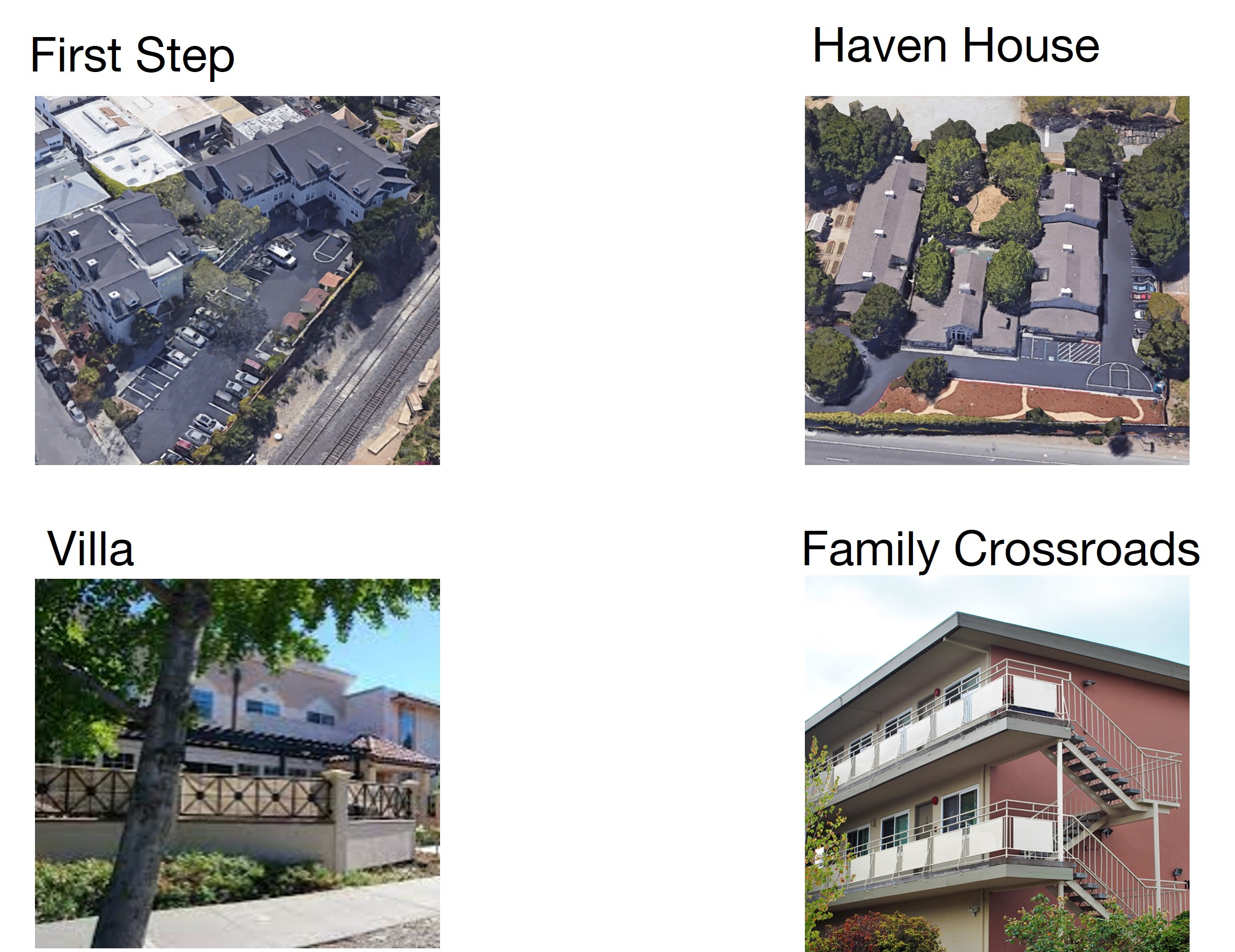
We visited other LifeMoves shelters to research best practices. We discovered there was no standardized practice. Each program director differed, but the primary reason for doing them was for the safety of the clients.
We did some ideation, tested rapid prototypes, and came up with two solutions to pilot for over a week each.
Solution 1: The Kiosk
What if we kept better track of clients at the front entrance?
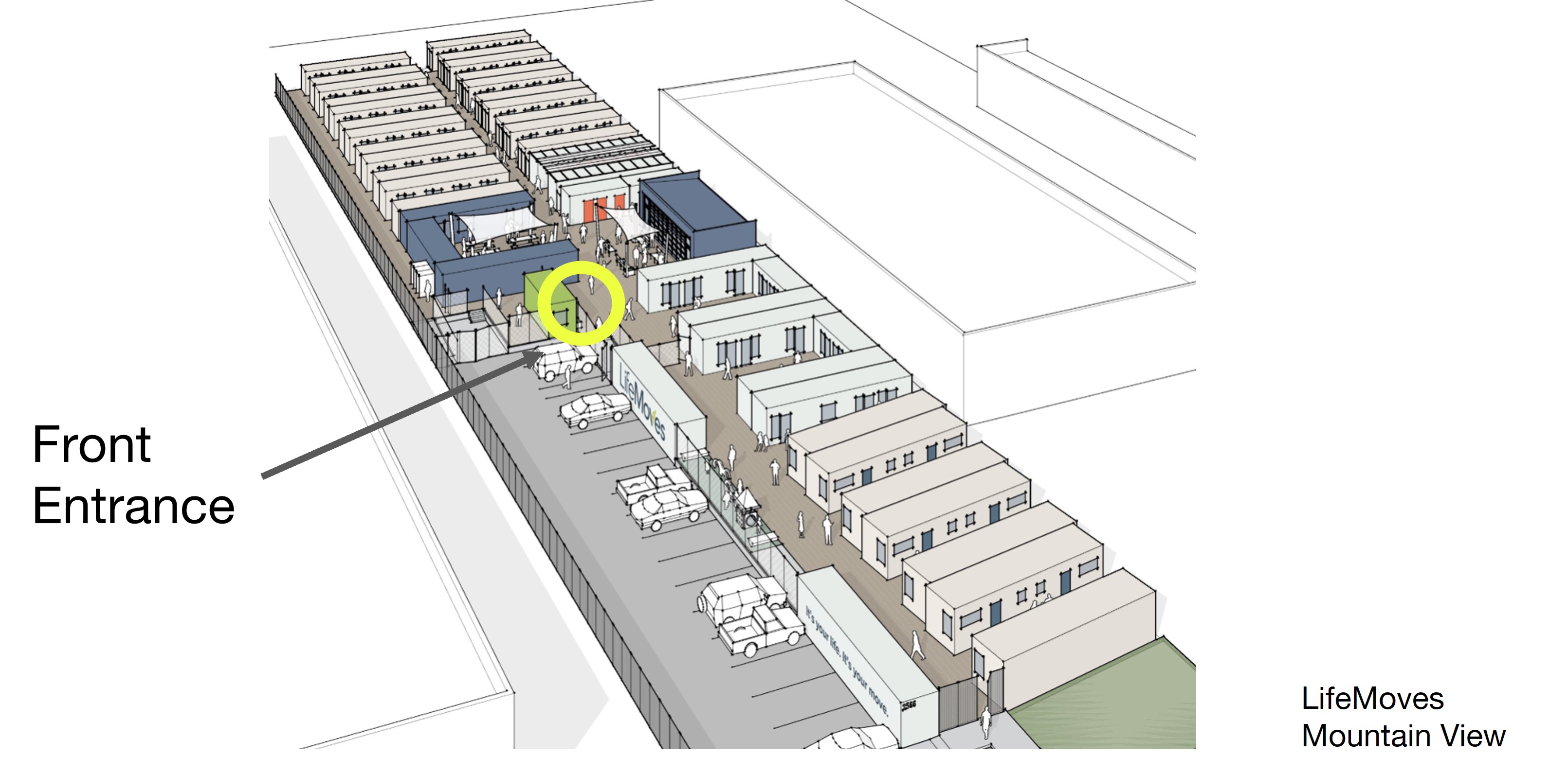
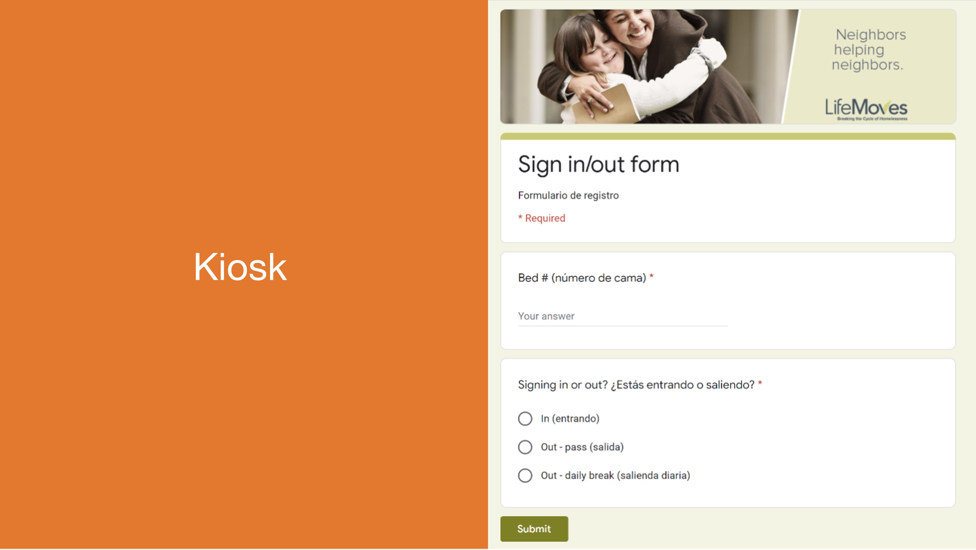
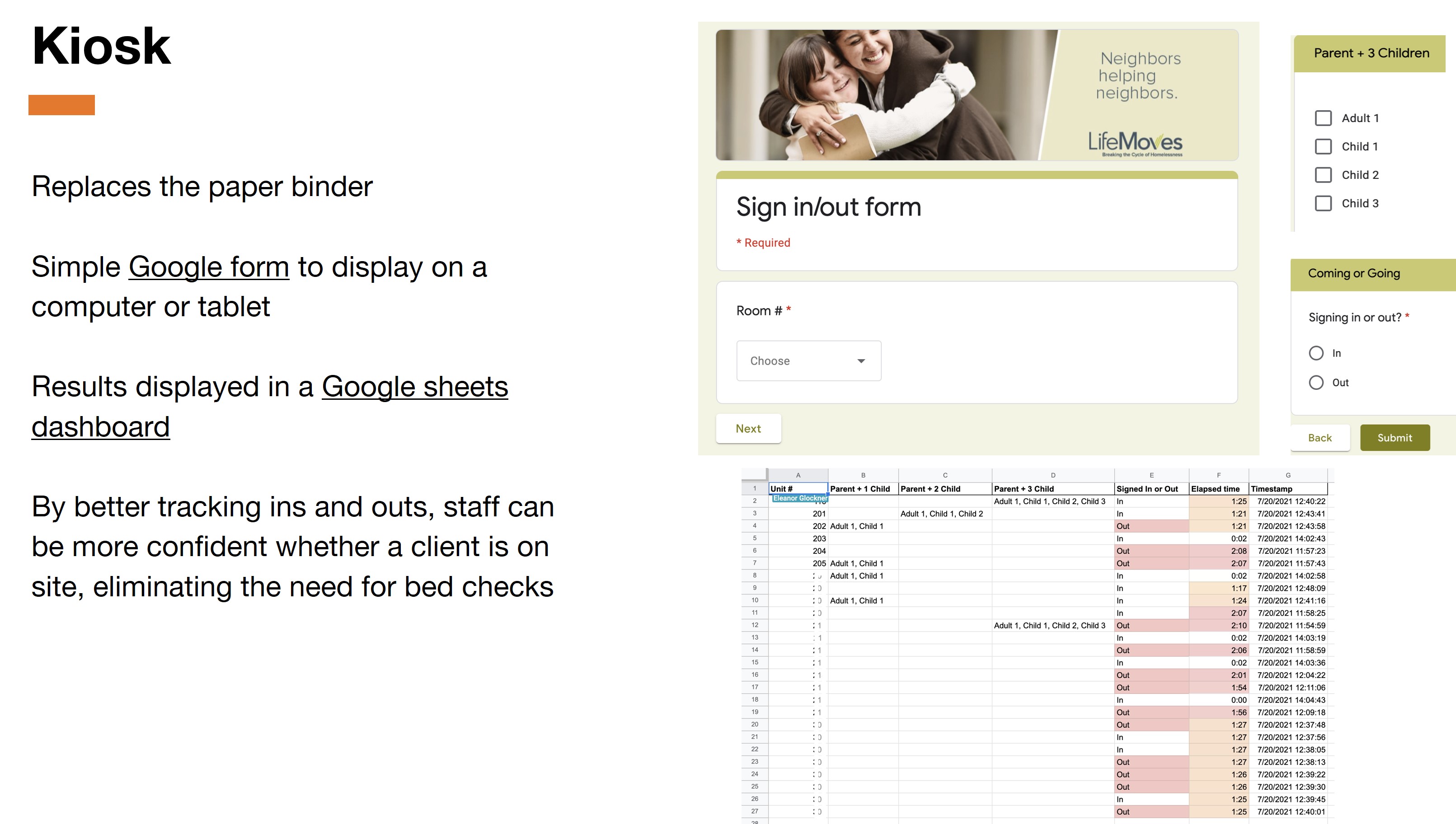
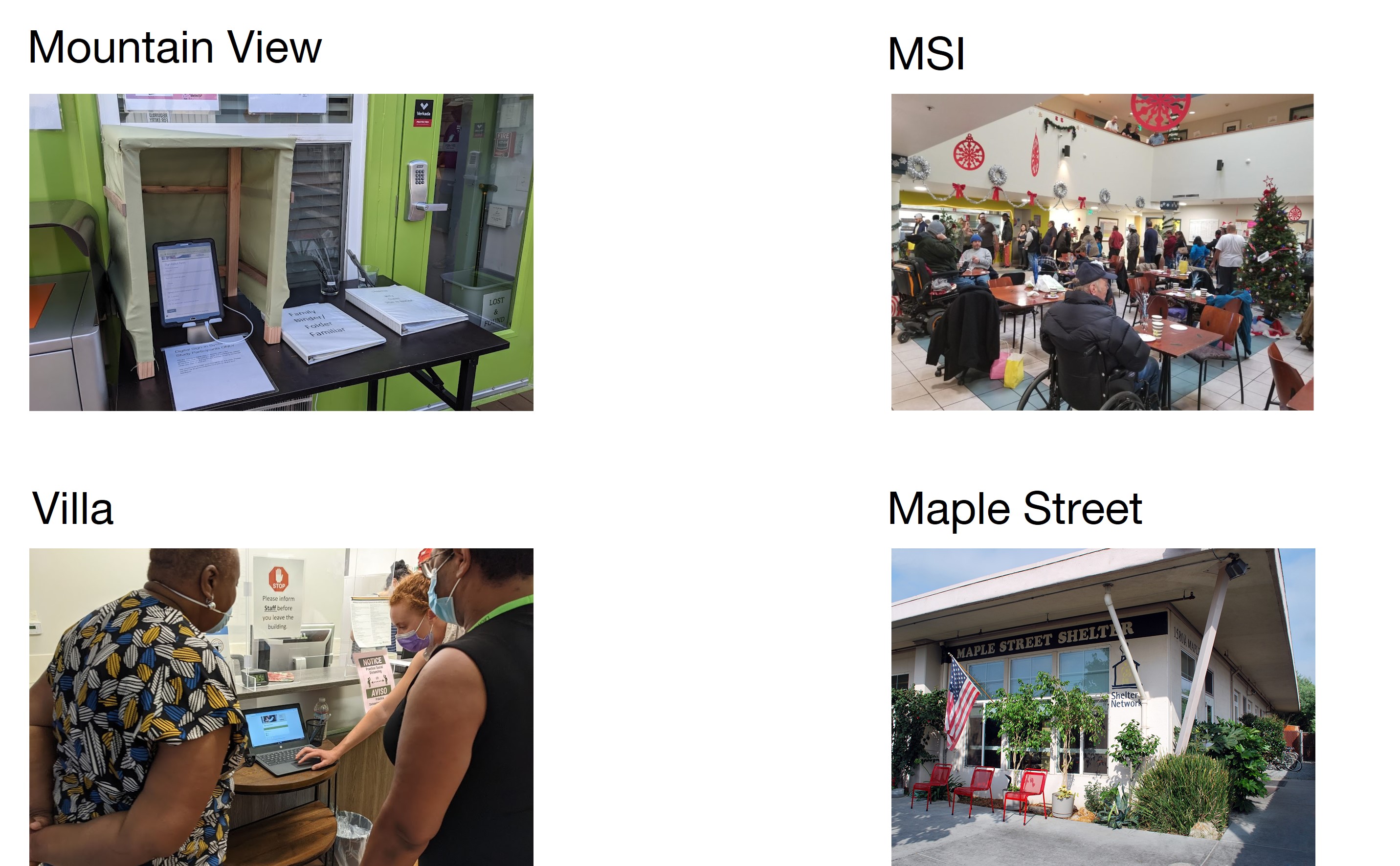
We piloted the digital kiosk at four sites for over a week.
We collected and compiled the results for one of the initial sites.
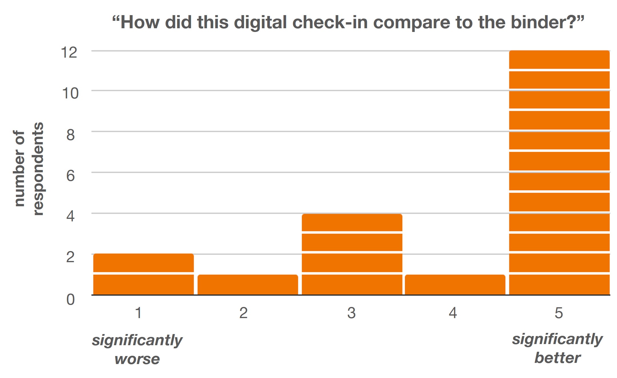
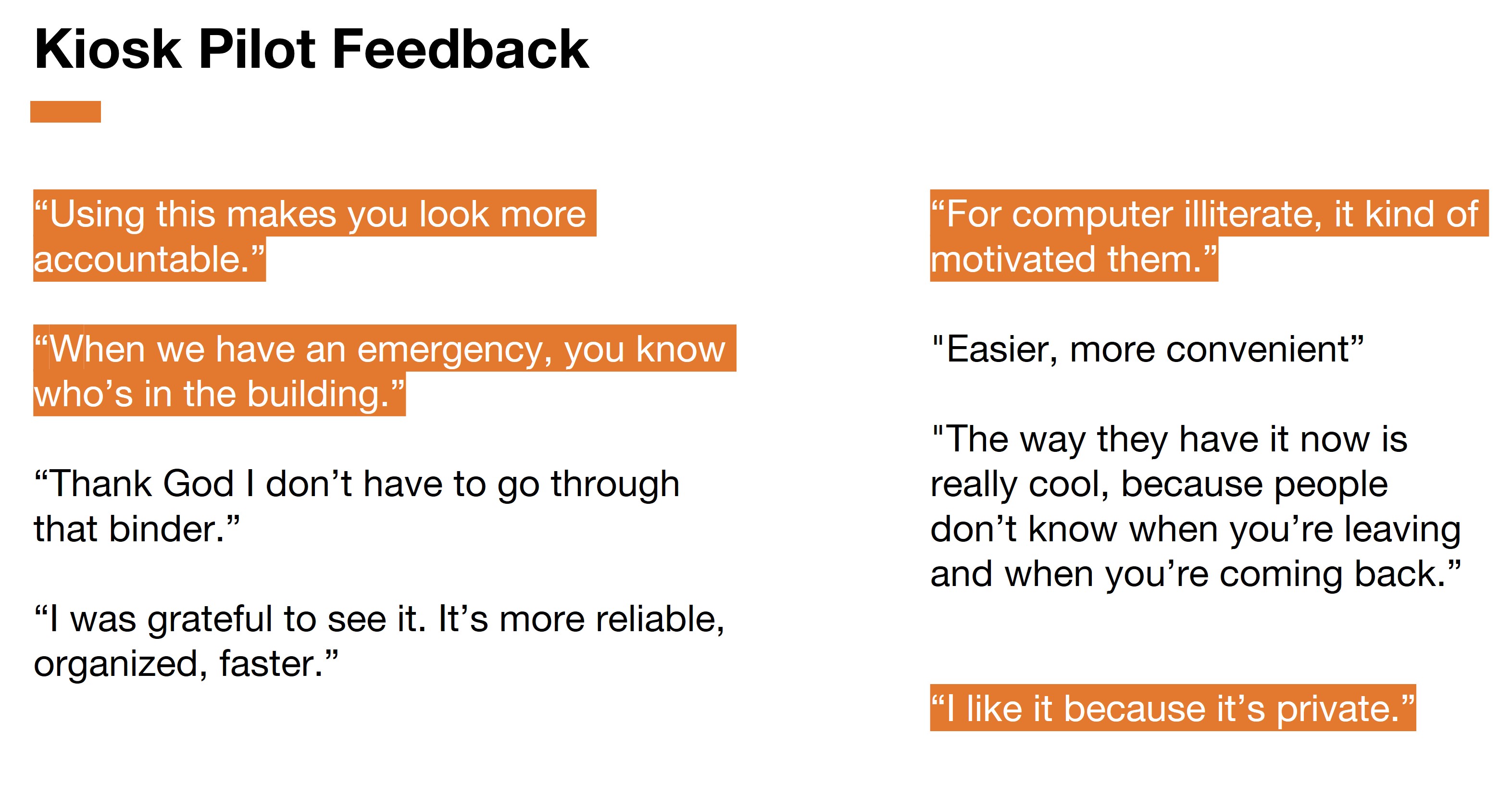
We were most surprised to hear that clients preferred the kiosk because it gave them privacy. With the old paper binder, other clients could flip through to see who is checked in or not - invading the privacy of other clients. With the kiosk, that data can’t be viewed. Another surprising finding was how useful staff found the digital dashboard. The dashboard let staff check in on high risk clients when they are gone too long to make sure they are safe. Case managers even commented that her clients started to ask for chromebooks - their familiarity with using the kiosk is now enabling previously digitally-averse clients to use chromebooks to start looking for jobs.
Solution 2: The Button
What if we made a button that clients could press to notify staff that they were present in their room?

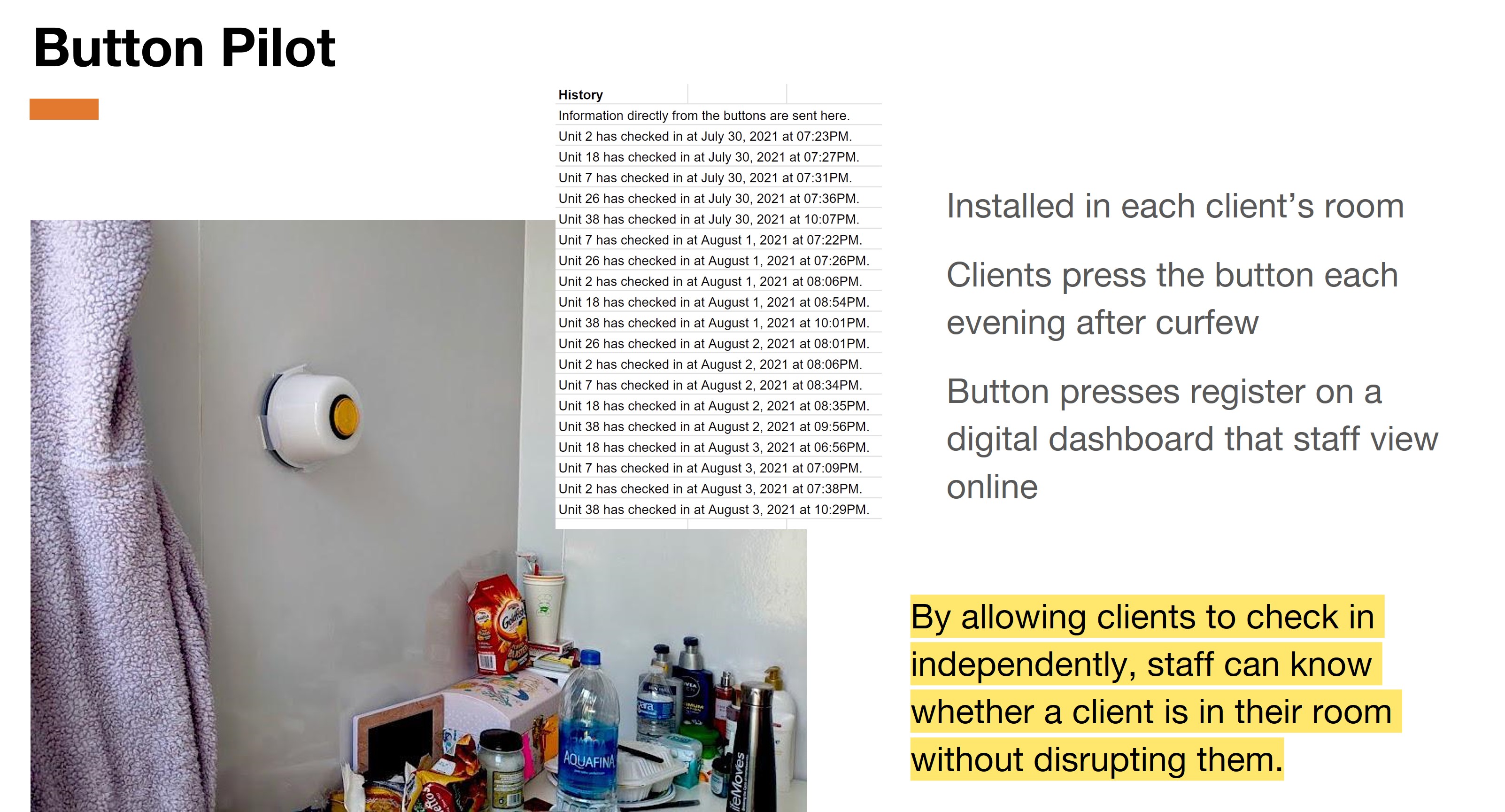
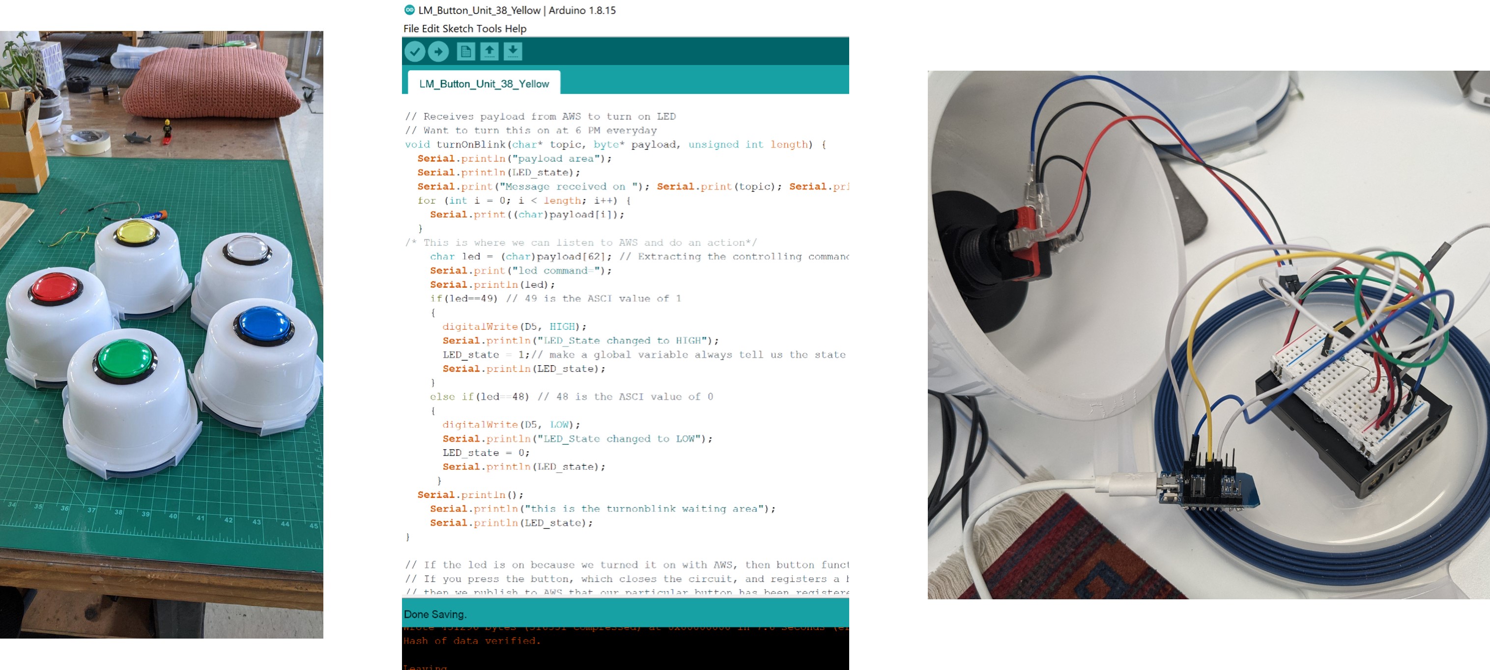
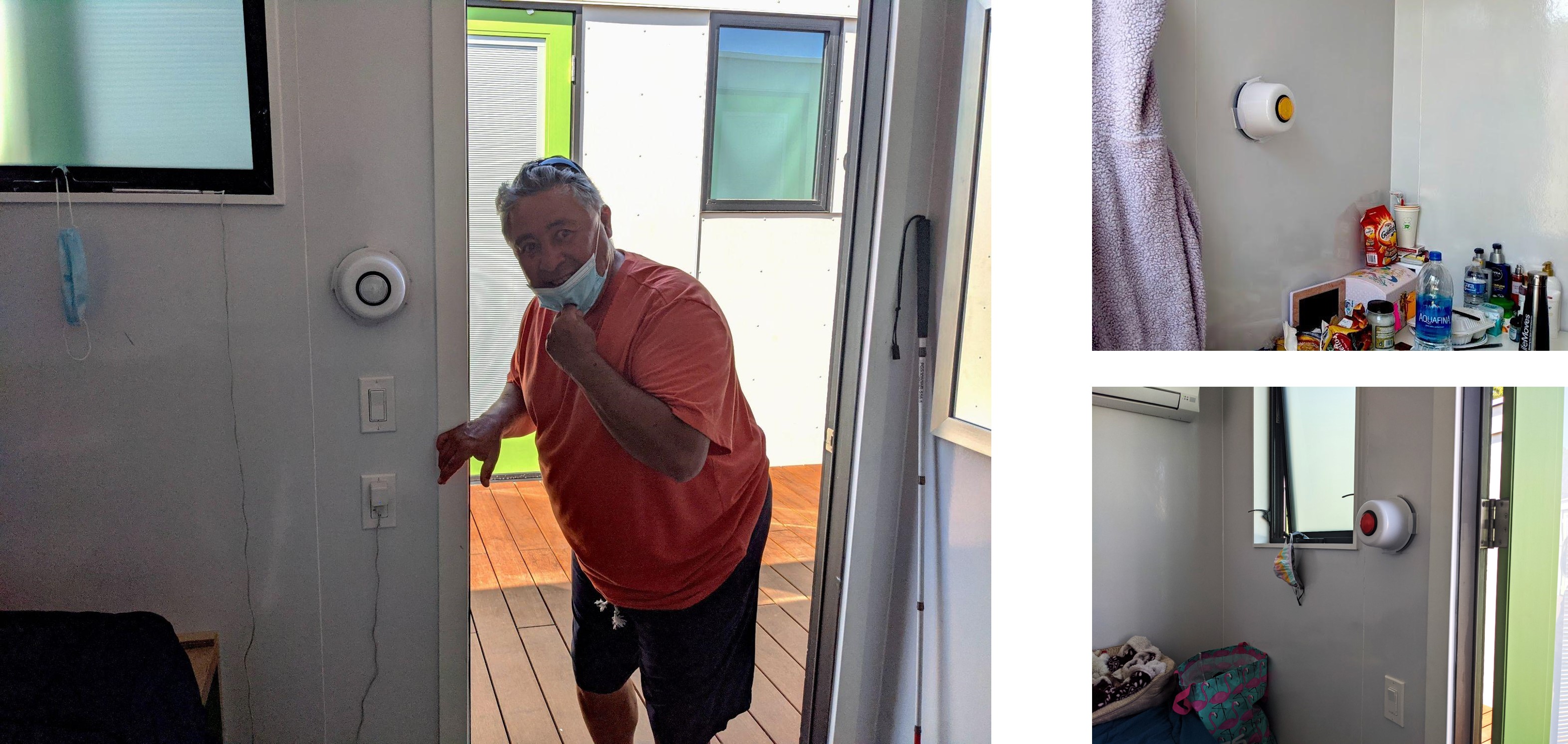
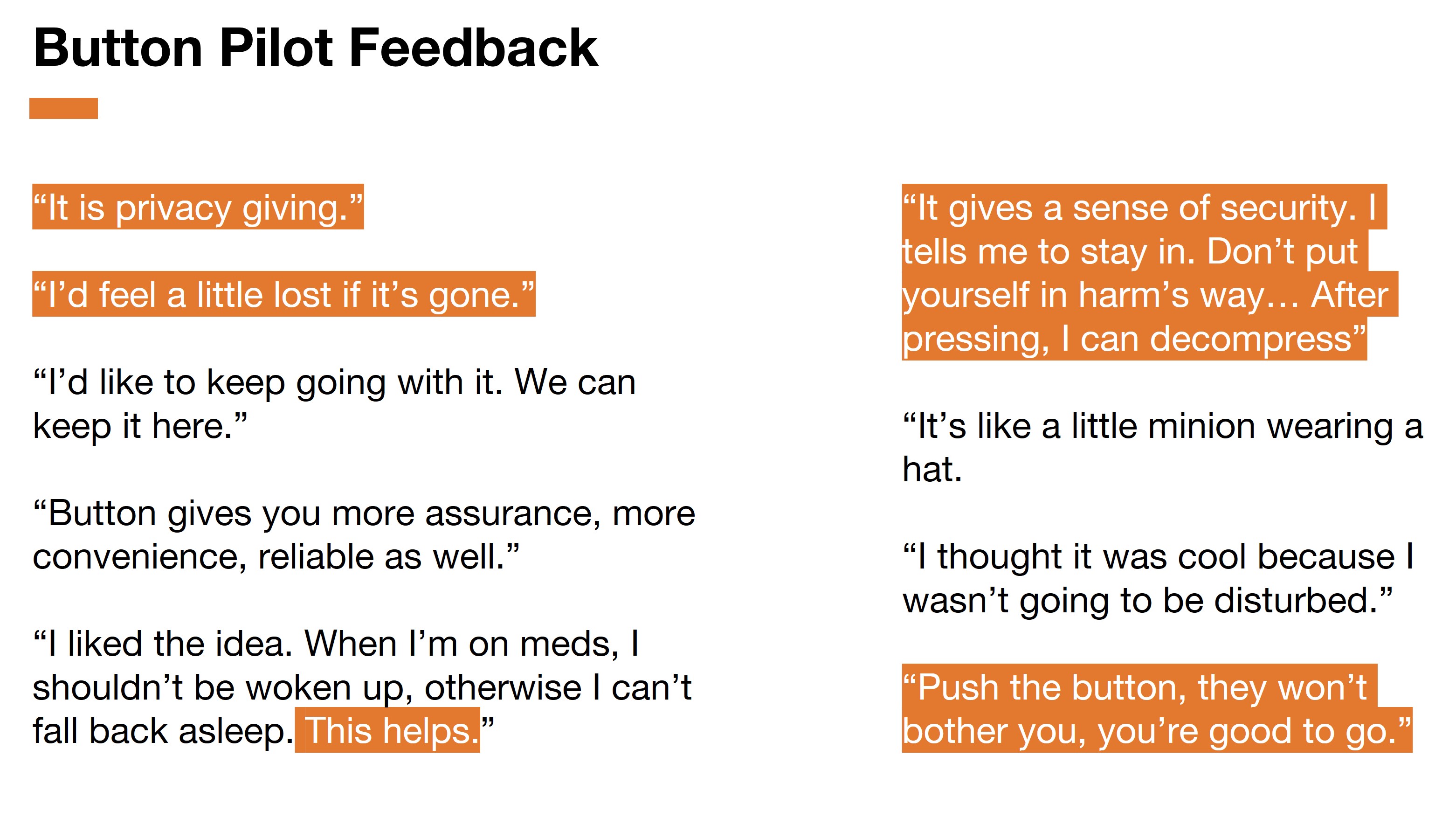
Clients loved the button. I coded the buttons using ESP8266 microcontrollers and connected each button to Amazon Web Services. One client didn’t want to give the button back after the pilot was over and another client who was losing his vision said he would feel a little lost without it.
Scaling & Implementation
Although clients loved the button and it was a novel joyous idea at the shelter, the decision to choose which one was not up to us. We presented both the kiosk and the button results to the leadership team at LifeMoves and collectively decided on the digital kiosk. We spent the next few weeks coding a robust kiosk interface, trained staff and installed digital kiosks at six shelters, and transferred ownership to the organization.
Real World Impact
Today the digital kiosk is used by six shelters, serving over 500 users daily. We designed a scalable, low cost solution for a nonprofit alongside the most vulnerable of populations.
Reflection
To date, this remains one of my favorite projects. We started by wanting to serve people experiencing homelessness, but ended up designing a solution that addressed the needs of staff, program directors, and clients. Staff no longer have to print paper binders, upload them, and shred the papers each day. Staff can better keep track and care for their clients. Program directors have live metrics on their interim housing sites. Most of all, clients no longer have bed checks which would wake them up, give them nightmares, and trigger past trauma. Clients now have more privacy with checking into the housing sites. What started as a solution for one shelter, expanded into a solution for multiple shelters of different types (family, couples, and singles).
Team
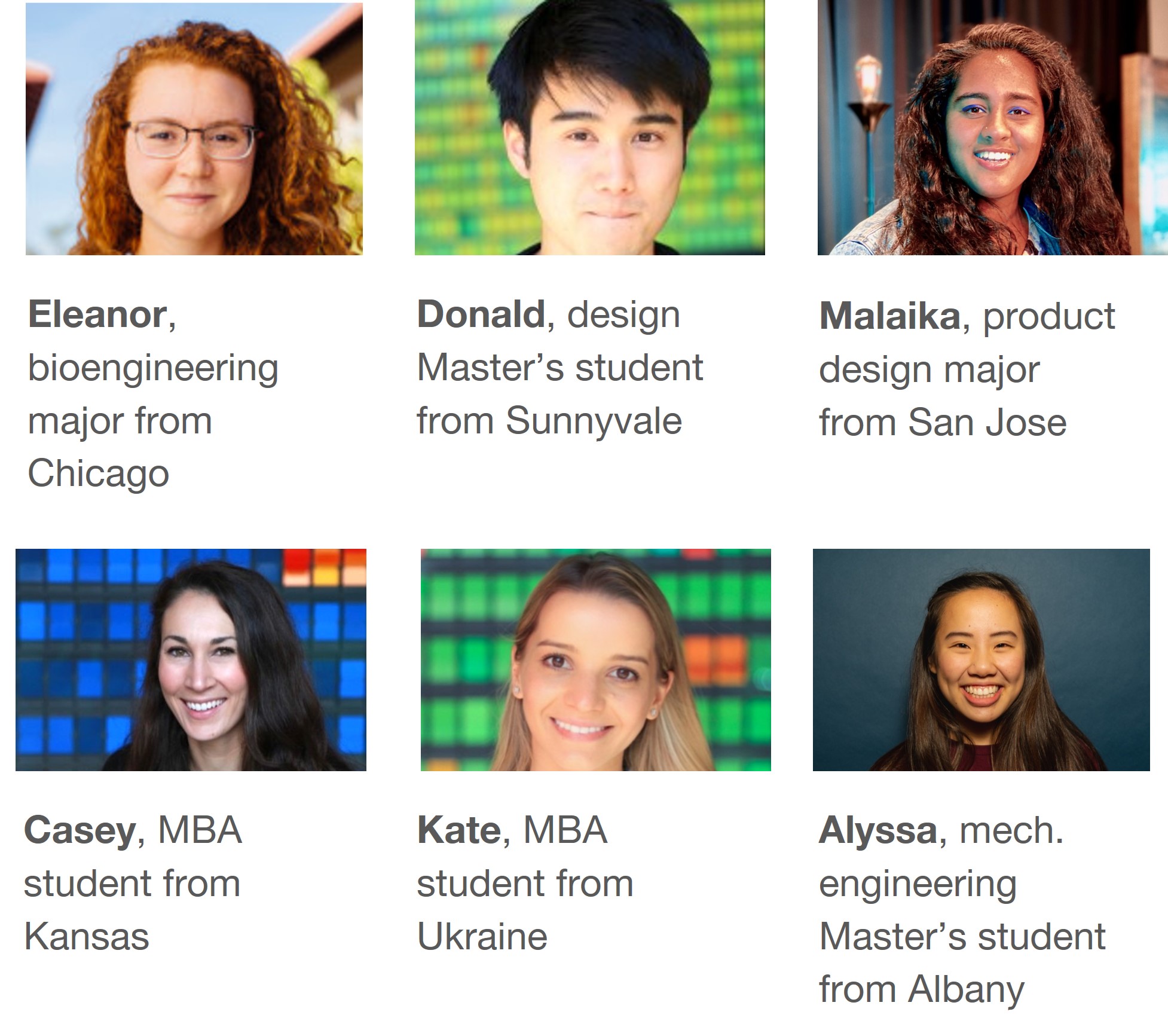
This project started with me, Eleanor Glockner, Casey Prohaska, & Kate Slunkova. Over the summer, Eleanor and I acted a co-leads, brought on Malaika Koshy and Alyssa Li to then drive the project towards completion.
Gratitude
This project would not be possible without the generous support and funding by Stanford’s Design for Extreme Affordability. In addition, we thank our mentors for their critique and guidance: David Kelley, Bill Burnett, Stuart Coulson, Manasa Yeturu, Nell Garcia, George Toye, Rosanne Foust, Michelle Jia, Michael Barry, & Julie Stanford.
